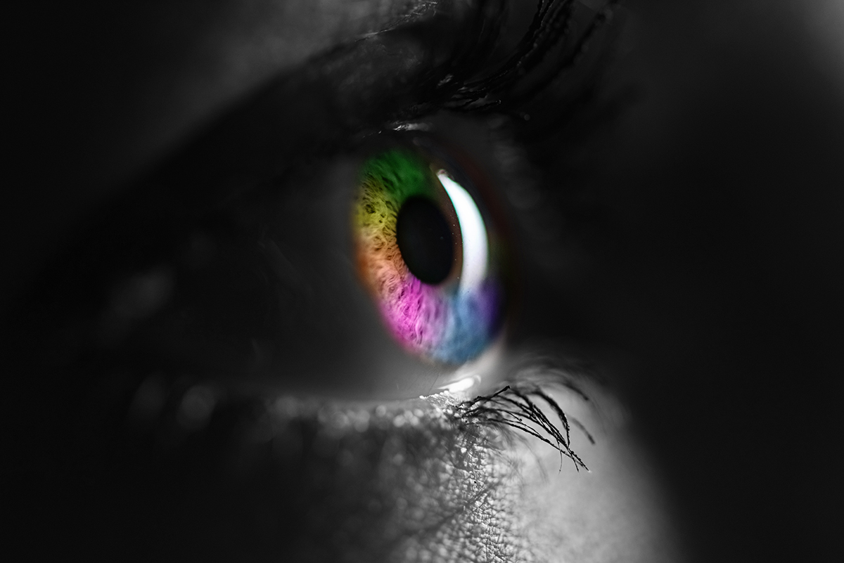
Words are powerful, but colours speak volumes without saying a thing. Colour choices have a subtle yet significant impact on audience perception and behaviour – colour psychology.

Colour is more than just a visual element; it’s a silent communicator that can evoke emotions, influence decisions, and shape perceptions. Research has shown that people make subconscious judgments about a product within 90 seconds of initial viewing, and up to 90% of that assessment is based on colour alone.
Understanding the emotional and psychological associations of different colours can help you make informed decisions in your content design:
1. Red: energy, excitement, urgency
Red can create a sense of urgency and excitement. It is often used for sale signs, call-to-action buttons, headlines, or to highlight important information. Red can create a sense of immediacy and draw attention to key points.
2. Blue: trust, stability, calmness
Used by financial institutions and tech companies and frequently used in backgrounds or for body text, blue conveys reliability and can improve readability in long-form content.
3. Green: growth, health, tranquillity
Popular in health and wellness industries, green suggests naturalness and harmony, used in infographics about sustainability or wellness, green can make data feel more approachable.
4. Yellow: optimism, clarity, warmth
Often used to grab attention, yellow can create feelings of happiness and optimism. Effective for highlighting key statistics or pull quotes, yellow can create a sense of importance without being overwhelming.
5. Purple: luxury, creativity, wisdom
Associated with royalty and luxury brands, purple can convey a sense of premium quality. Often used in headers or sub headers for thought leadership pieces, purple can add a touch of sophistication to your content.
6. Orange: friendliness, confidence, enthusiasm
Often used in call-to-action buttons, orange is energetic without being as aggressive as red. Great for social media graphics or blog post featured images, orange can make your content feel more inviting and shareable.
7. Black: sophistication, luxury, authority
Used to create a sense of exclusivity or luxury in high-end products. Used effectively in white papers or case studies, black can lend an air of authority to your most in-depth content.
8. White: purity, cleanliness, simplicity
White space is often used to create a sense of space and cleanliness, particularly in minimalist designs. Essential for creating breathing room in your layouts, white space can make your content feel more organised and easier to digest.
To effectively leverage colour psychology in your content marketing, start by understanding your brand personality. Choose colours that align with your brand values and the emotions you want to evoke.
It’s equally important to consider your audience, as different demographics may respond differently to various colours. Research your target audience’s preferences to ensure your colour choices resonate with them.
When implementing these colours, use contrast wisely. Ensure your colour choices create enough contrast for readability and to guide the eye to important elements on the page. Consistency is key in colour usage; use your chosen colours consistently across all content to reinforce brand recognition.
The power of a button colour
I recently spoke with an e-commerce client about their conversion rates, which were lower than industry standards. When I looked at their website, I noticed their call-to-action (CTA) buttons blended into the overall colour scheme, making them easy to overlook.
We suggested they change the button colour from their muted brand blue to orange. This complementary colour stood out clearly against the blue background, making it more noticeable. (We had already implemented this in their newsletters. The buttons here were also left-aligned, knowing that most readers scan content in an F-shaped pattern.)
The results on the website were, in their words, “amazing how something so little could have so much impact.” Within a few months, they saw an increase of more than 30% in the click-through rates on their website.
In digital marketing, minor adjustments can often lead to substantial improvements. The key is making it simple for your audience to take the next step with your brand. But, when implementing colour psychology in your content, be wary of:
- Cultural differences: colours can have different meanings in different cultures. Ensure your colour choices are appropriate for your audience.
- Overuse: too many colours can be overwhelming. Stick to a cohesive colour palette.
- Accessibility issues: ensure your colour choices meet accessibility standards for those with visual impairments.
- Ignoring context: the meaning of colours can change depending on the context and industry. What works for one brand may not work for another.
Incorporating colour psychology into your content marketing strategy is about more than just making things look pretty. It’s about understanding the subtle language of visuals and using it to communicate more effectively with your audience. When used thoughtfully, colour can be a powerful tool to enhance engagement, build brand recognition, and drive conversions.
